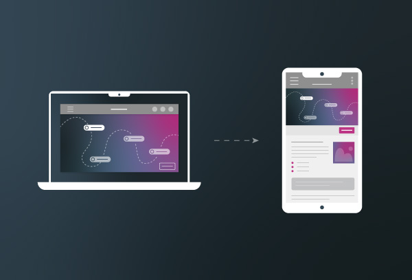
As more learners turn to mobile devices to access their learning content, it’s becoming important to build learning that is both accessible and responsive on different screen sizes and devices. Responsive learning is the design process of creating eLearning content that automatically adjusts to the size of a device's screen and it’s orientation while also having the same learning outcomes as it would on a much larger screen. While Accessibility is the creation of eLearning content that overcomes barriers such as disabilities (mental and physical), age, and location of its learners.
Why is Mobile Learning Important?
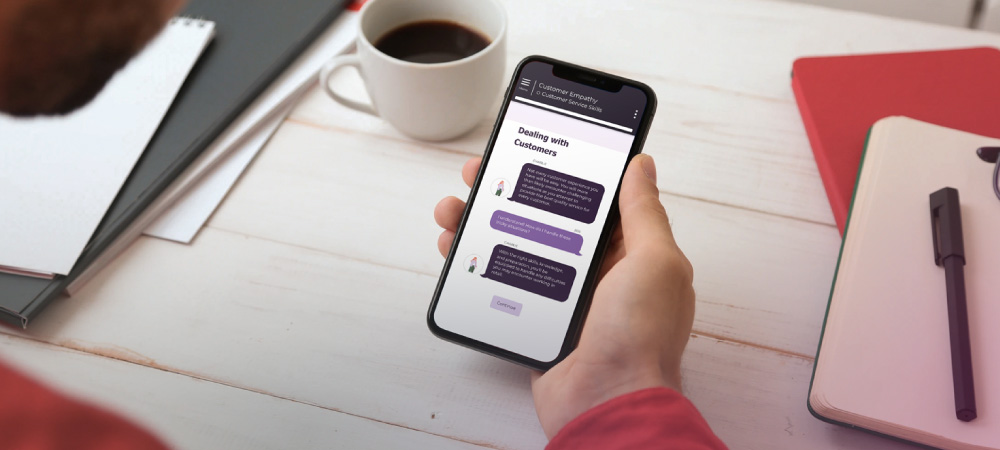
Mobile learning is becoming more and more important as the days pass. Not only does it allow learners to access content anytime, anywhere, and on any device, but it also aligns with the flexibility of the new work-from-anywhere wave. As a learning designer, it is essential that you design your eLearning content with mobile learners in mind so you can ensure you are meeting the needs of these types of learners.
Content for the Mobile Learner
Mobile learners have different needs than those on other devices. As a designer, you want to make it easy to access, engaging, and relevant. To create this type of content, consider using microlearning, interactive videos, and gamification. These formats are more engaging and effective on mobile devices than traditional learning content.
How Responsive Learning Promotes Accessible Learning
Responsive eLearning content promotes accessible eLearning by ensuring that learners with disabilities have equal access to the content. By designing content with responsiveness in mind, you can ensure that learners who may have visual, auditory, or other physical disabilities can access and engage with the content on their preferred device. For example, responsive design can ensure that learners with low vision can enlarge text, learners who are hard of hearing can turn on closed captions, and learners with mobility impairments can navigate the content using assistive technology.
Responsive eLearning content promotes the consumption of content in a way that is comfortable and intuitive for the learner. Learners can choose the device and screen size that best suits their needs. For instance, online learners that prefer more tactile learning can choose to complete the course on a tablet over a computer.
Tips for Creating Mobile Learning
Plan Ahead: Consider the needs of mobile learners when planning your eLearning content. This includes designing for different screen sizes, orientations, and operating systems.
Design with small screens in mind: Keep your design simple and avoid clutter. Use a clear and readable font, and avoid using too many images or videos that may slow down the loading time.
Choose the right interactions: Mobile learners prefer interactions that are simple and easy to use, such as swiping, tapping, and scrolling. Avoid complex interactions that require a mouse or keyboard.
Clear and simple: Use concise language and avoid jargon or technical terms that may be difficult to understand on a small screen.
Make the most of your chosen authoring tool and its capabilities: Choose an authoring tool that supports responsive design and accessibility. Use its features to create engaging and interactive content that works well on mobile devices.
Test across different devices: Ensure that your eLearning content works well across different devices and operating systems by testing it on a variety of devices.
Ensuring that you design learning that is both responsive and accessible is critical to meet the needs of today's diverse learners. By planning ahead, designing with different devices in mind, choosing the right interaction options, being clear and concise, and leveraging your chosen authoring tool’s features, you can create engaging accessible learning content that can be completed anywhere, by anyone.